Information Architecture Redesign
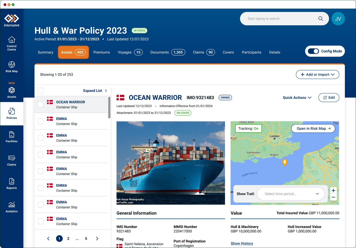
As a prerequisite to scaling the Insurwave platform to handle multiple lines of business with large volumes of data and an increased user base, we redesigned the platform to streamline the user journeys and improve the structure of information. User complaints and feedback played a central role.

The Results
16%
50%
Reduction in number of steps to achieve key tasks
U-turns recorded on Hotjar - Down from 33% three months prior
54
NPS score in Feb 2024 - Up from 49 in Nov 2023
My Role
Card Sorting Workshop
Usability Research
Wireframing
Hi-Fidelity Mockups
User Testing
Design System
The Team
UX/UI Designers
Product Owners
Client Success
Engineering
The Tools
The Year
Figma
Miro
2023
Insurwave is a web based platform for specialty insurance brokers, buyers and insurers to manage their risks such as aircrafts, vessels, and properties, and make decisions based on real-time data-driven insights.
The Information Architecture Redesign was the first project on the platform that I worked on after joining Insurwave.
The Project
My Role
Card Sorting Workshop
Usability Research
Wireframing
Hi-Fidelity Mockups
User Testing
Design System
The Team
UX/UI Designers
Product Owners
Client Success
Engineering
The Tools
The Year
Figma
Miro
2023
The Goal
To improve ease of navigation, clarity and scalability, and to simplify user journeys by reducing the number of steps to perform a task.
The Process
To achieve quick and innovative problem solving, we used the Double Diamond Design Methodology. The model is broken up into four key stages, Discovery, Define, Develop, Deliver.
Since Client Success teams had collected a lot of feedback from their regular communication with our clients, we took this feedback, analysed it and listed the issues users faced.
Discovery
From the early days of the startup, the platform was built with new features plugged in without much thought given to usability and structure.
Client Success Teams constantly received feedback from users about their difficulty finding information and the complexity of the platform navigation.
Hotjar screen recordings revealed unclear user journeys, screen real estate not being utilised effectively to show relevant information, and important information being hidden behind several clicks and loops.
The company had ambitious plans to scale the platform offering, hence there was an immediate business need to streamline the user journeys and redesign the platform to have structure and clarity.
The Problem
Once we understood the issues, we worked with other teams to define our goals and also challenge our own assumptions and the current architecture.
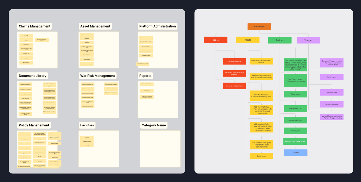
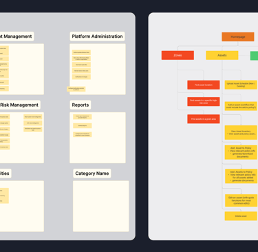
Card Sort Outcome of one of the participants
After the workshop, we analysed the results and were able to come up with an Information Architecture that aligned with how the participants were thinking about the platform data.
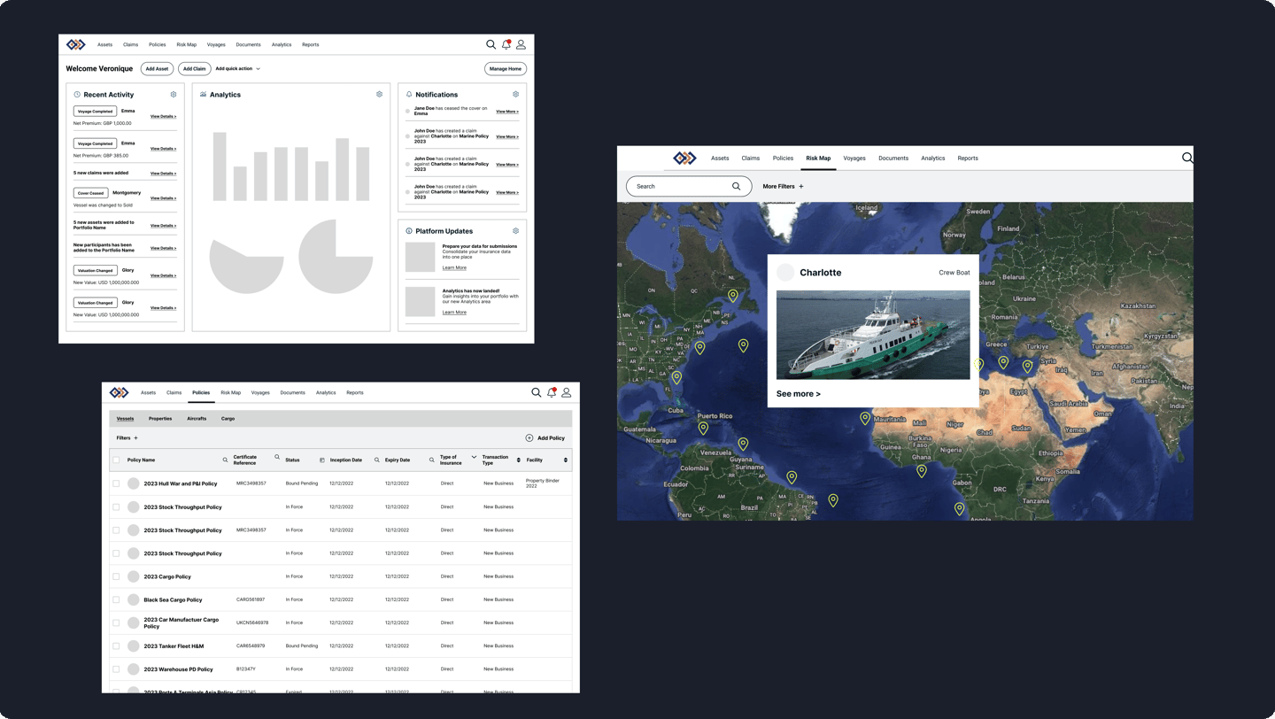
A snapshot of the new Information Architecture showing the Risk Map and Policies section which has the most issues.
Define
We conducted a Card Sorting Workshop to organise content on the platform into categories. Due to constraints with involving our clients for this session, we involved the teams closest to the users - Product Owners and Client Success.
Card Sorting
To resolve the issues with the number of clicks and ineffective use of real estate, we started with some research on best practises used by other platforms.
Removing Policies View from the Risk Map
A lot of user complains were around the confusing way in which the Policies information was overlayed over the Risk Map. We decided to dedicate an entire page to the Policies View and move it out of the interactive Risk Map. This way the user could focus on what information matters to them.
Left Side Nav vs Top Nav
We decided to move the nav menu to the top to create more real estate for data the users are looking for.
Sub-Navigation
We decided to introduce sub-navigation, to help create a hierarchy of information, hence reducing clicks, bringing in more structure, and keeping information relevant to its context.
Two Pane View
Many platforms use two panes to display information, one for the list and the other to show the details of the item the user selects. We decided to introduce this structure into our platform to help with the problem of users having to check and update multiple assets, hence reducing U turns.
Develop
Design Research
Next, we created wireframes based on our research. Through multiple iterations we refined the journeys to build out a working prototype.
Wireframes
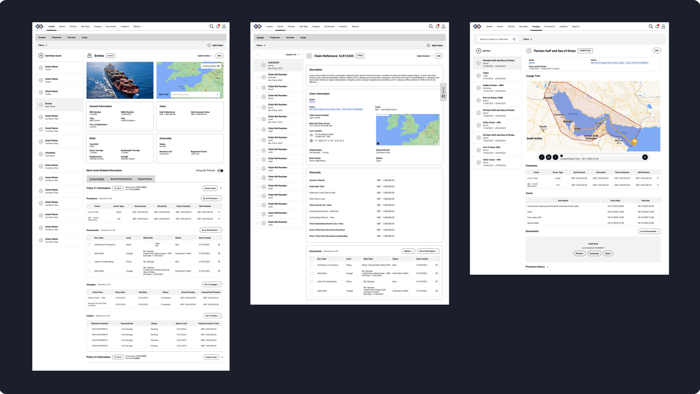
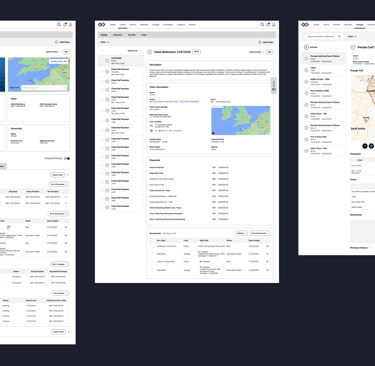
Wireframes to test changes in Information Architecture and navigation
Wireframes to test changes in Information Architecture and navigation
We tested the prototype with 3 clients. With their permission, we recorded the session to analyse later on. Once we completed the tests, we used the feedback we received to incorporate into the next revision of the prototype.
What worked well
The general consensus was that layout and hierarchy was much clearer and content was easy to find. The feedback was helpful to validate our design decisions.
Removing Policies View from the Risk Map
This made the user journeys simpler and kept information focused.
Sub-Navigation
Users mentioned this helped clarify where content was and removed the frustration of moving between the risk map and policies section on each click.
Two Pane View
This reduced multiple clicks to navigate between many assets, hence reducing time to complete tasks.
Deliver
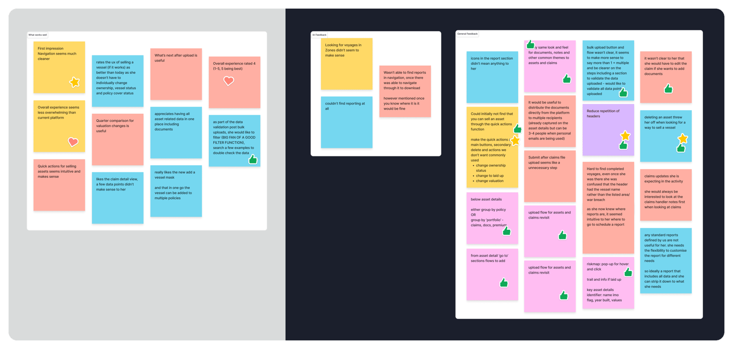
User testing
What did not work
Findability
We received valuable feedback around improving the findability of lesser used features and refining some user journeys.
IA Categories
The users thought the new IA categories were not clearly understood. We used this feedback to refine the category titles.
Top Nav
The top nav seemed to be unpopular with users who were used to side navs from other platforms.
User Testing: What worked (left) and feedback and inputs from users (right)
During this step, we extended the Design System as needed to incorporate new components and styles and created Hi Fidelity prototypes that we handed over to engineering teams.
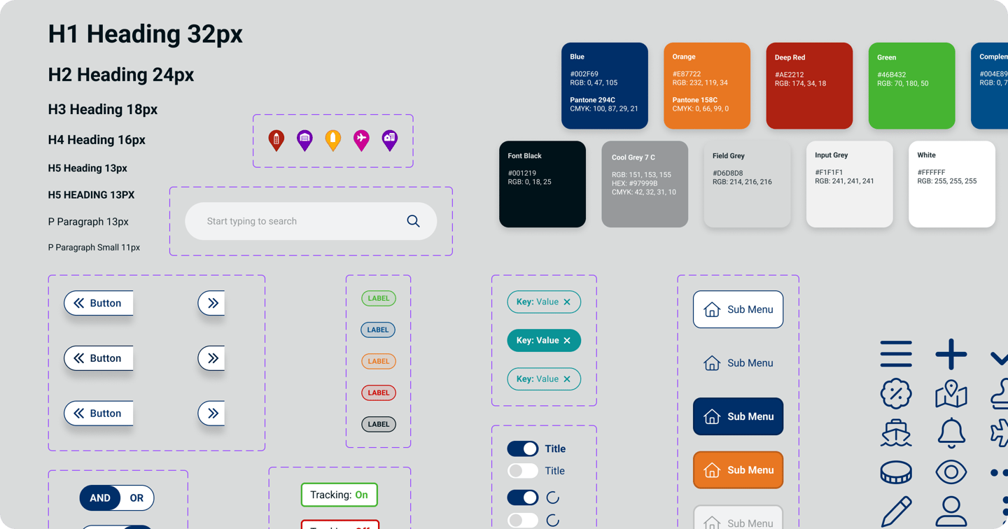
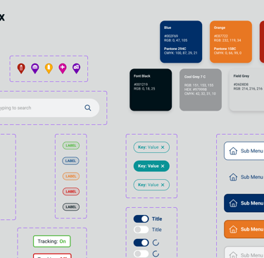
Hi Fidelity Mockups
We updated the Design System with new components
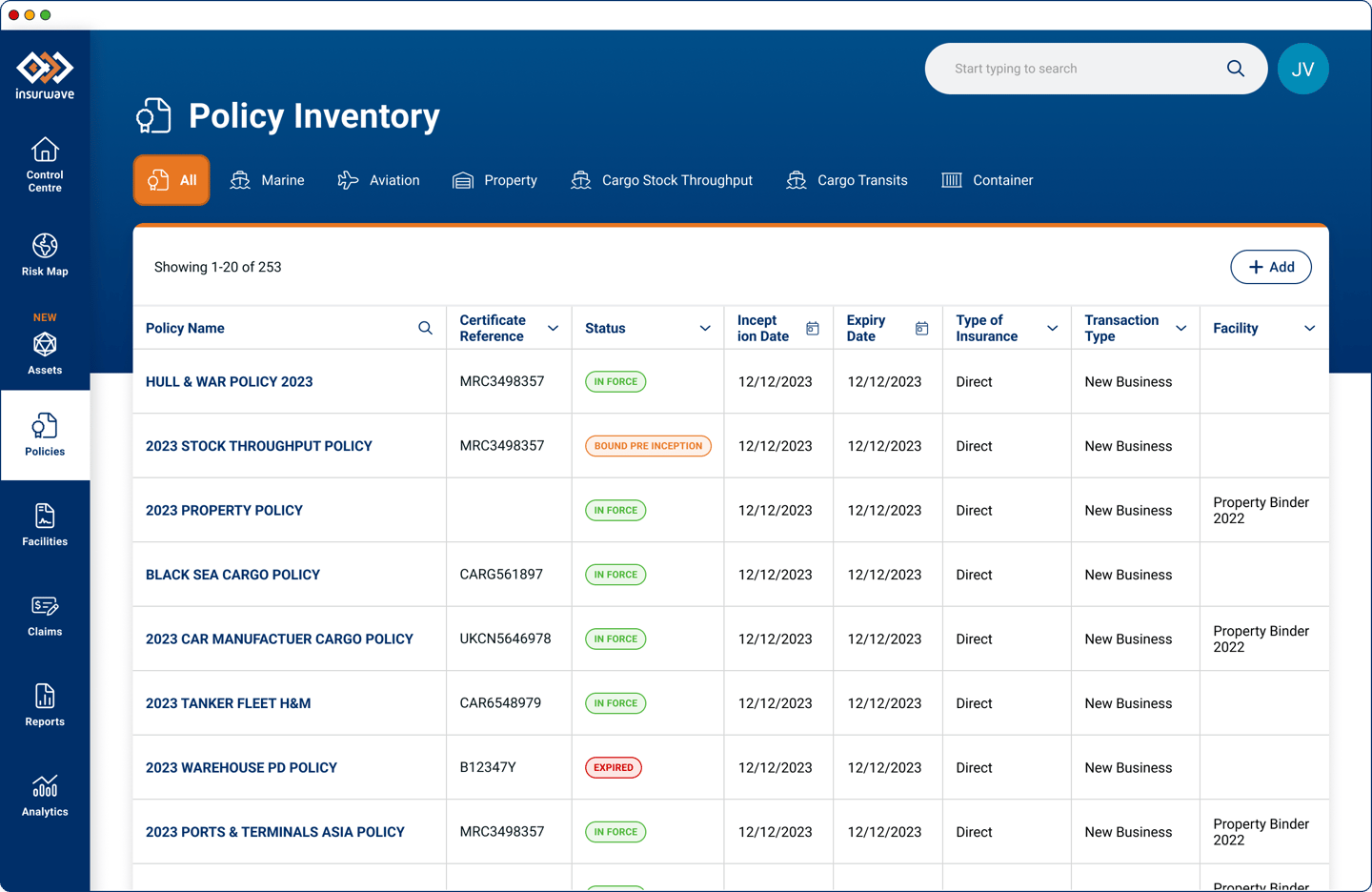
A segment of the Hi Fidelity Prototype
Being a large project, the redesigned screens were rolled out incrementally. We worked in collaboration with the engineering teams, product owners, client success to transition to the new designs smoothly.
The Outcome
NPS Score Improvement
Our NPS survey before and after the changes were implemented showed an increase in user satisfaction. We were rated 54 in Feb 2024 as compared to 49 in November 2023.
Reduced U-Turns
Our weekly Hotjar viewings showed how much better the users were able to navigate around the platform. The U-turns recorded by Hotjar were reduced to 16% from 33% for the same user set in the three months prior to the changes.
Reduced U-Turns
Compared to before the changes, we designed the new screens to take fewer steps to perform key tasks that users perform on a regular basis, like editing assets, marking assets as 'Sold', removing assets from cover, viewing premiums within a policy, to name a few. We estimate almost a 50% reduction in the number of steps.
